Please don’t misunderstand the headline. If you have the ability to access a designer, you should. But too often, especially developers like me are forced to design pages even though you know nothing about graphic design.
Whether you don’t know any designers, can’t afford designers or don’t have time to outsource the design job, you are forced to design your website yourself. Then you probably know the following situation.
You choose a template at themeforest.net and insert your content. But after you have inserted your texts, images and icons, you realize that your website doesn’t look nearly as stylish as it originally did in the template.

Source: https://imgur.com/gallery/20jQdFL
If you have experienced this situation, you should definitely read on. In this article you will learn step by step how to choose a suitable template for your website and how to add suitable content. You can also find an updated summary of this tutorial in my GitHub account.
github.com/AtichDev/lists/HOW_TO_DESIGN_A_WEBSITE_AS_A_NON_DESIGNER_CHECKLIST.md
Intention
What is your intention with the website? Defining “increase sales” as the intention will not get you anywhere. Be specific and think about what core function you want your site to have. Most of the time we think that the more actions we offer, the higher the probability that one of the actions will appeal to the user. Unfortunately, this idea doesn’t work out. The truth is that no one will feel appealed and your page will be closed faster than your browser has loaded everything.
Good design is about creating clarity, guiding the user and leading them to their destination. Every additional choice (click option) that distracts from the core function should be well weighed.
Specific examples of the core function of a page would include:
- Fill in the contact form and send it.
- To add the product to the shopping cart.
- To inform about the company.
As you can see, your website can have several core functions. However, it should always be clear which user uses which areas of the page and what the core function of each subpage is.
Target audience
Who is your target audience? I bet you won’t be able to see this question soon. Every business coach and business article has probably asked this question in one form or another. But unfortunately, it doesn’t make this question any less important.
Your site can have different target groups. If you run a platform with merchants and consumers, you have different target groups with different needs and expectations. In such cases, each of your subpages should be tailored to one of the target groups.
Specific examples of target groups would be:
- Male aged 18 to 45, interested in soccer and music, down to earth, has/wants to start a family, …
- Female aged 35 to 50, interested in healthy diet and fitness, already had some surgeries, concerned about your health, …
Emotions
Now let’s get to the biggest gamechanger. Think about what emotion you want your audience to have before they perform the core function of your page.
Why is emotion so important? Imagine that one person from your target group is the dream of your sleepless nights. If you want to win this one person over, hopefully you won’t tell them how strong, intelligent, empathetic, or whatever you are. Instead, you’ll intuitively want to make sure your dream partner has a great time in your presence. Those positive feelings that your dream partner has had in your presence will be associated with you as a person.

The principle of anchoring emotions with brands has been used by advertising agencies for a very long time. The deceptive thing, however, is that different people can also associate different emotions with one and the same thing. Conversely, it means that if an emotion works for one target group, it doesn’t necessarily work for another.
Example please? While one person thinks of luxury when they think of Rolls-Royce, another thinks of ignorant polluters. That’s why the first two steps are so important. If you know your audience well, you can better respond to their emotions and motivate them to take action on your website.
If you are creating a website for a security software, you certainly want your users to associate a sense of security, stability and reliability with your software. Depending on who your target audience is, you can achieve this in very different ways.
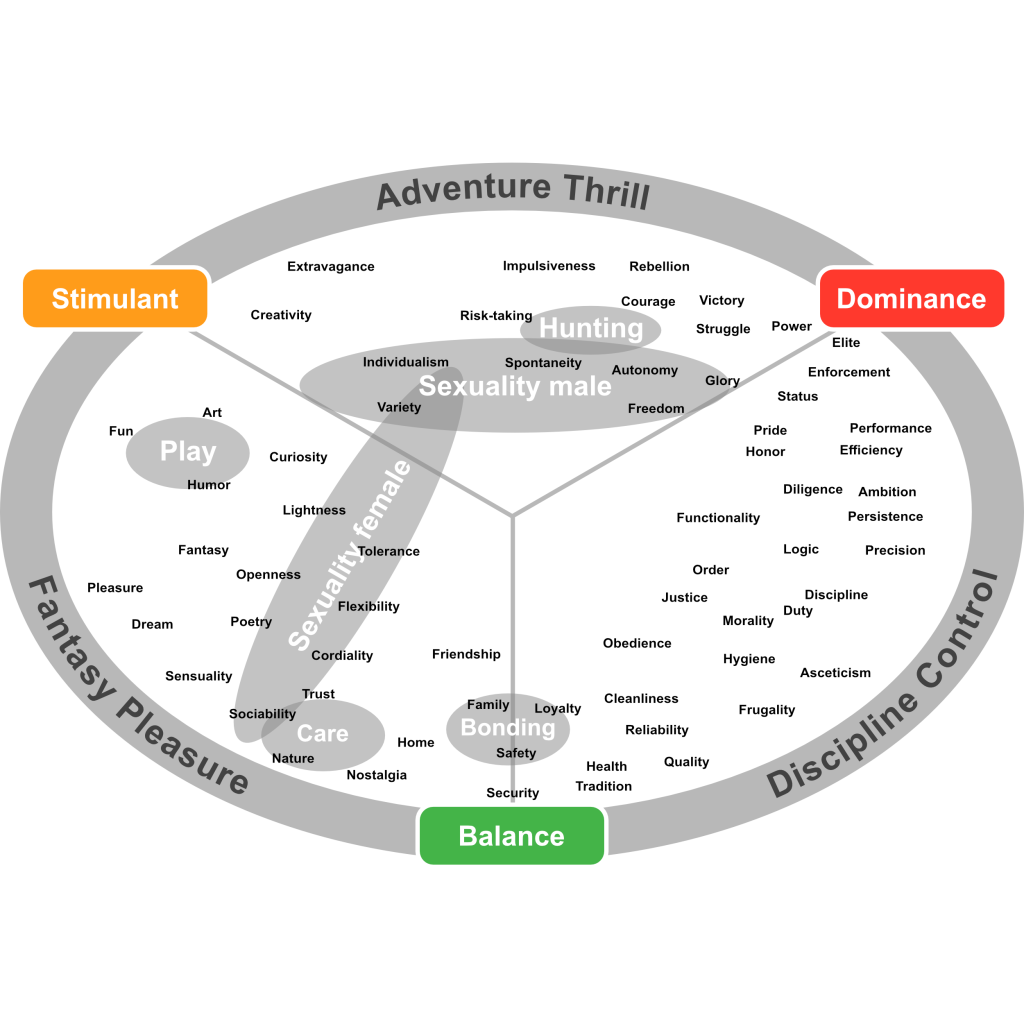
For example, a gun enthusiast is more likely to feel positive feelings of stability and security when a tank is brought forward. For most other people, negative feelings would be more likely to be aroused. Therefore, think carefully about what emotion you want your target audience to have when using your website. For inspiration on different emotions and values, check out the Limbic Map.
Find template
Now it’s time to look for a suitable template. You now know what emotion you want to arouse in the target group. Think about which industry is also trying to arouse this emotion in your or a similar target group.
Examples are:
- Luxury and exclusivity → Jewelry
- Relaxation and recreation → Spa
- Adventure → Camping, Travel
Fortunately, you’re not alone in the world. There are thousands of talented designers who have created websites before you. And it gets even better, there are now also countless templates for all sorts of themes and audiences. One of my first go-to sites for this purpose is the themeforest.net platform. There you can find thousands of templates for all kinds of industries and target groups. Search there specifically for the industries that want to arouse the same emotions in your target group.
Whether you buy the templates or just use them for inspiration, keep in mind one of the most important rules when replacing content: Stay consistent
The following sections will tell you exactly what you need to keep in mind.
Extract color palette
Your color palette should consist of about 4 colors. Gradations of the selected colors in brightness and saturation are not unusual.
Primary color: Most often, the color appears in the logo or buttons with the highest importance. The primary color should be used rather sparingly. By using it too much, it loses its importance and becomes less noticeable.
Secondary color: The secondary color is usually less noticeable than the primary color, but harmonizes with the primary color. It is used, for example, where alternative calls to action are presented.
Foreground color / text color: The regular text should be easy to read, so it should have a legible font and a good contrast with the background. Most often this color is very dark or even black.
Background color: This is the color behind the texts, so the background color should have a high contrast with the text color. In many cases, white or a very pale gradation of the primary or secondary color is used for this.
You can extract the colors from your template using the following technical tools:
- Use a browser extension such as ColorZilla
- Take a screenshot and open the image in a graphics program of your choice. Then use the eyedropper to extract the color.
- You upload your screenshot to Adobe Color‘s online tool and let the tool do the rest.
Select font
If you have purchased a template, this point concerns you less. If you use the template only as inspiration, you should be careful with the fonts. Just like images, fonts are often licensed. Purchased templates usually include the right to use the font.
Otherwise, your task is to find out which fonts have been used. In web pages, the font can be found out with the browser extension WhatFont. Most websites use fonts from Google Fonts. These are free of charge. If your font is not found at Google Fonts, it will most likely not be free.
However, if you have an image as a template, finding the right font becomes a bit more difficult. Unfortunately, I don’t know of any tool that reliably matches the font from an image with the fonts from Google Fonts. Therefore, there is nothing left to do here but to open Google Fonts and search for a visually similar font yourself using the built-in filters.
Another source for fonts is the dafont.com platform. At dafont.com you can set in the filters which license and other properties the font you need should have.
Most websites use about two different font families. One for headlines and particularly eye-catching lettering, and one for normal body text. Choosing good fonts that match each other is a science in itself. Again, my recommendation is to deviate as little as possible from your template.
Select icons
Symbols are older than writing itself. They are an incredibly important and efficient way of communication. Especially websites with many functions can no longer do without the use of icons. Symbols for use in web pages are called icons. Icons are very simple yet to the point illustrations that can significantly increase the usability of your website.
Fortunately, there is a large selection of freely available icon sets here as well. From a design point of view, most icons differ primarily in these properties.
Multicolored ↔ Plain
Filled ↔ Bordered
Pointed corners ↔ Rounded corners
In your template, pay attention to what properties the icons you use have and stick to those properties.
Here is a small selection of icon sets that may also be used for free:
- https://jam-icons.com
- https://fontisto.com/icons
- https://iconmonstr.com
- https://evil-icons.io
- https://ionic.io/ionicons
- https://fonts.google.com/icons
- https://feathericons.com
- https://fontawesome.com
- https://lineicons.com
Sometimes it doesn’t need to be a whole icon set, but just single icons. For the search of single icons in a certain style the following platforms are suitable.
Select images
Choosing an image that evokes the right emotion in your target audience and also fits well visually into your website is the most difficult exercise in this guide. If you have found an image that fits well in terms of content, but is visually out of line, there is a small tip below on how to adjust the image visually.
To search for images, you can use these portals, among others. As always, pay attention to the licenses and terms of use.
For photos, the platforms are suitable:
If you need more illustrations and vector graphics, I can recommend the following platforms:
Now we come to the promised tip. If your image doesn’t quite match the design of your website visually, it’s often because the colors used in your website and the image don’t want to harmonize. Fortunately, you can quite easily put a color veil over the image to create more harmony on your website.
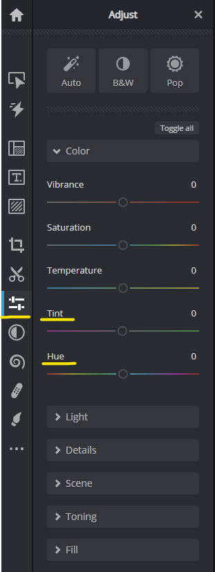
If you have a little experience with any image editor, use the image editor you are familiar with. For the others I recommend to use the online tool pixlr.com for this purpose.
Open your image with Pixlr. Then click on the Adjust & Filter icon in the left navigation bar. A menu with more options will open. Now click on the Color field and play a bit with the sliders. For me, the options Tint and Hue have proven themselves.
Writing texts
Last but not least come the texts. With texts, the motto is as little as possible, as much as necessary. Because let’s face it, no one likes to read long texts unless it’s one of their favorite novels. It’s the same with your website. Too often I see websites where companies present themselves. It should be clear to everyone that you are not the center of the universe, but your users are. At least everyone wants to be treated like the center of the universe.
For example, try to think about clothes. Do you think about the genre of clothing in general or do you have concrete images of pants, skirts, dresses and other concrete items of clothing in your minds eye? It is the same with fashion buzzwords. So why not communicate directly what’s what. Instead of service-oriented simply write 24 hours a day available for you by phone.
Keep in mind who your target audience is and with which emotion you want to communicate.
If you lack ideas on how to formulate a short text, you can get inspiration from tools like copy.ai. Just enter a few keywords and let the artificial intelligence generate a text for you.
Before you publish your texts, you should ideally have them read by another person. As an alternative or as an additional check, tools such as grammarly.com are suitable.